Design & Documentation Systems
Systems and Documentation General Approaches
The images and descriptions below describe the approaches I take when constructing efficient processes and documentation standards in product led companies.
Maintaining clear, efficient, and self reinforcing conventions across design tools and documentation platforms is important so that design, development, and product teams, as well as leadership, all know where to go to find what they need and understand the relevance of anything they’re looking at.
This page dives into my approaches around:
- Knowledge base organisation.
- Component construction and documentation.
- Use of docs in page content definitions.
- User journeys and flow documentation.
- Release prototypes.
- Documentation maintenance and rewrites.
Organisation & Scratchpads
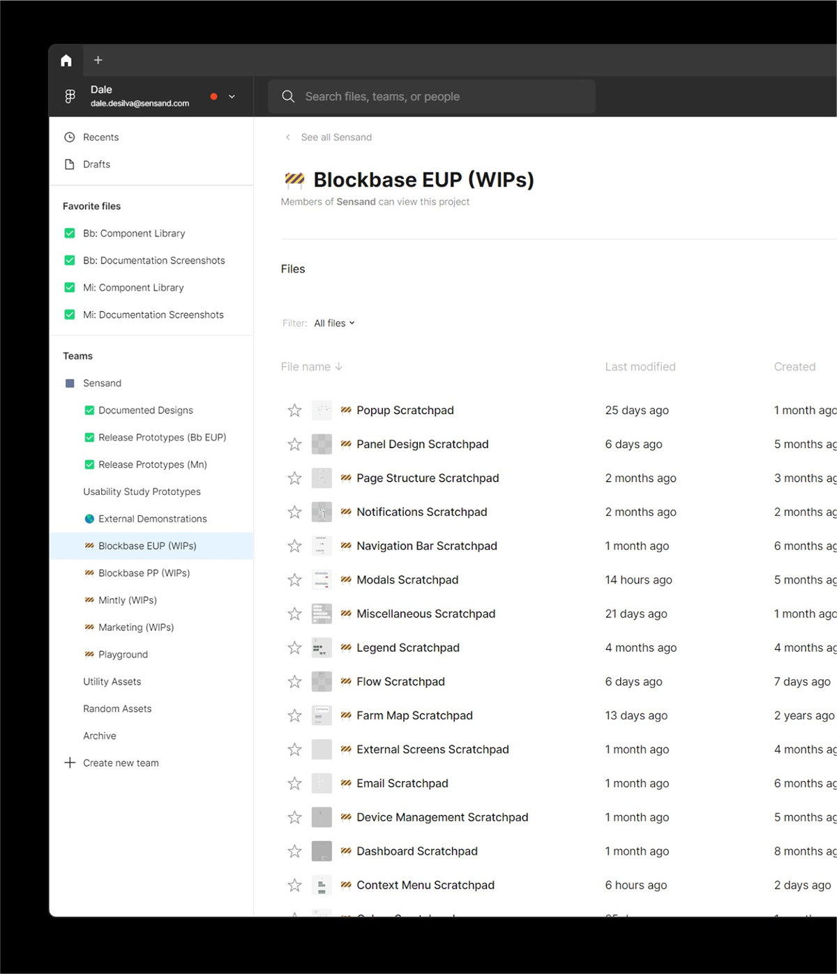
In both design and documentation tools, every type of artefact should have a predefined place. In a prototyping design tool, this begins with having a clear naming convention to indicate work-in-progress files that designers should work within to start and develop their designs.
Without these, designers can work directly in files that other team members are currently utilising or they can work in private drafts that will be unfindable when the team member is away—Or even unrecoverable if the person leaves the company.
The screenshot below demonstrates how this manifested using Figma in a previous team. Clear naming and use of emoji’s ensures an understanding of what’s expected in each file.
Component Construction
Especially in teams, it’s important to consciously define the expectation of how each team member should work with components—So that components can strike the right balance of versatility, specificity, and functional consideration.
In a previous project, we were building components that not only defined assets that the developers would utilise, but that would also be exposed to users in a visual page builder. I therefore defined 3 categories to help the team’s mental model around component design..
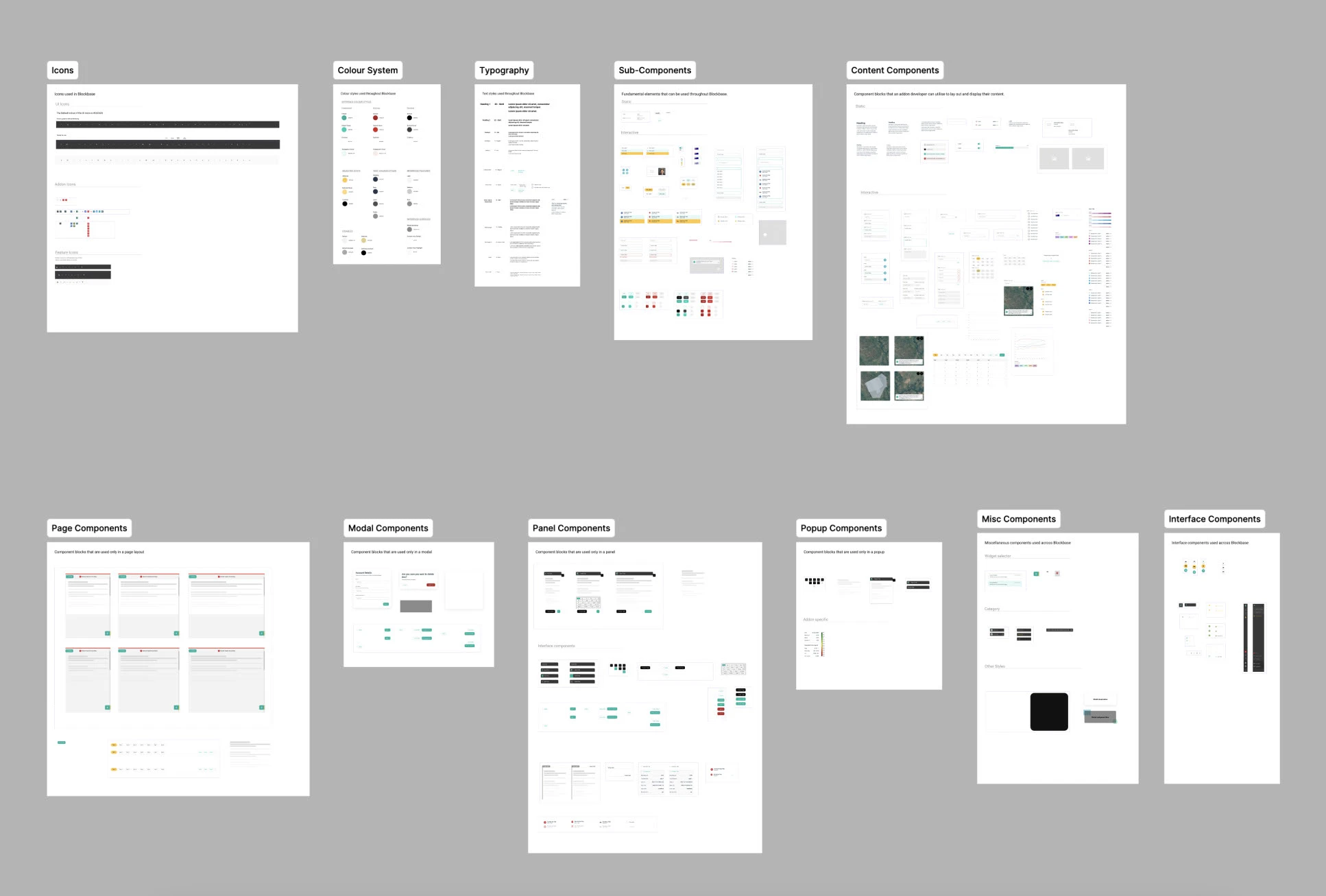
Sub-components are elements like icons, buttons, checkmarks, labels, input boxes, etc. The fundamental visual artefacts that are used to create many other components. These are only used by the internal design team and don’t necessarily have a 1 to 1 relationship with how the developers build it.
Block components (Referred to as content components in the screenshot), are components that are designed to fit right onto the page and often incorporate functionality involving more than one element. These components incorporate padding and spacing for consistent use on pages and in other containers.
Container components are the pages, panels, popups and any other components that act as containers for block components.
Block components and Container components are those that would be usable by the end-user if building their own interfaces in a no code interface.
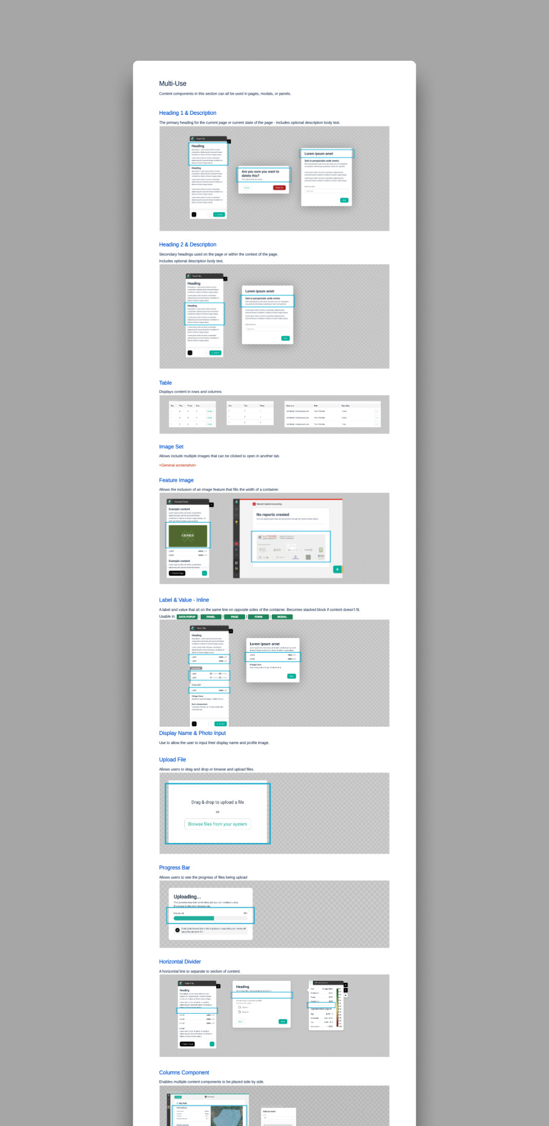
Below is an example of one of our component libraries in Figma.
Component Ease of Use
In the above three categories, Block components were designed to enable designers to drag and drop components together, with each block component containing it’s own top and side padding. This enabled an easily controllable approach from developers during construction and would facilitate the same kind of simplicity from users in a visual page builder.
In development, the spacing could be defined in the container component with a CSS variable, which meant for different container components (e.g. a wider page versus a narrower popup), the spacing for all blocks could be dynamically adjusted easily. In Figma, however, this was done by selecting all blocks and adjusting their padding manually according to specs. Now, however, this could be driven in a similar way by utilising Figma variables.
Various block components are shown below as raw components and in the context of a popup container.
Component Update-ability
Very careful consideration also goes into how to control and enhance the modifiability of components. An in-use component edited incorrectly by a team member unfamiliar with it can break existing designs, and with complex products that rely on many common assets, it’s also important to ensure the opposite - that things are still easily update-able when necessary. In Figma, Organisation plans can partially mitigate these issues, however, in lower end plans, they’re a significant risk.
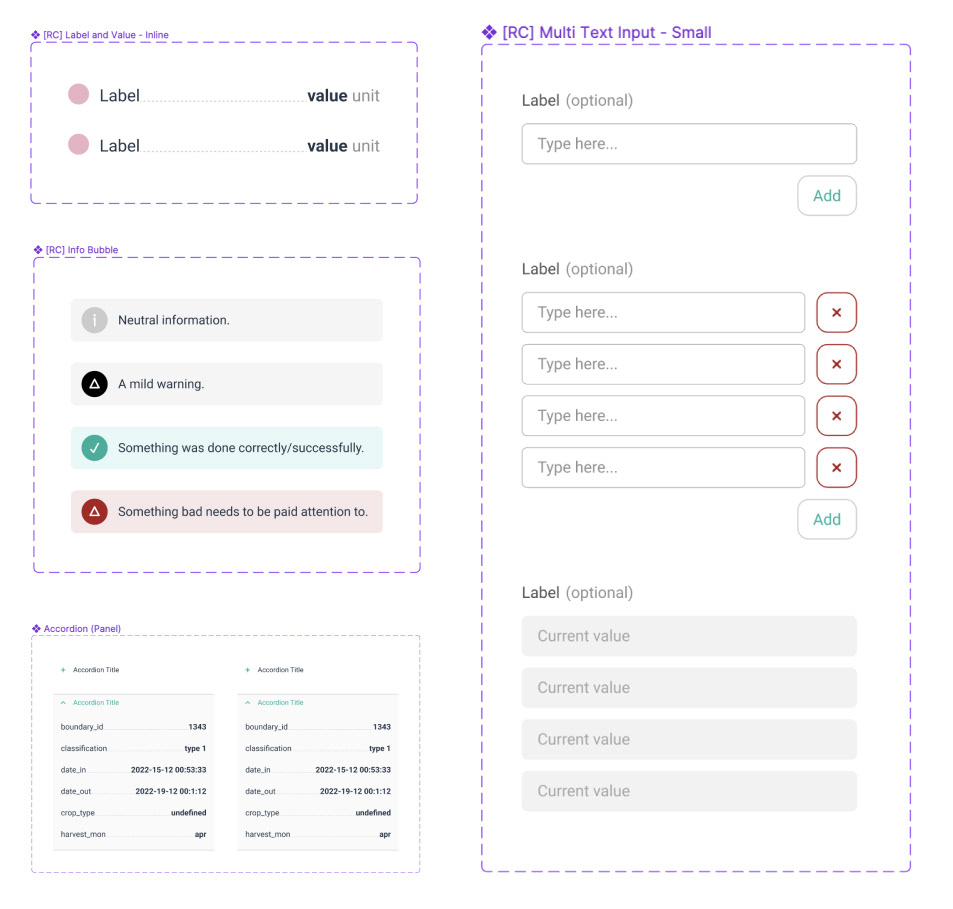
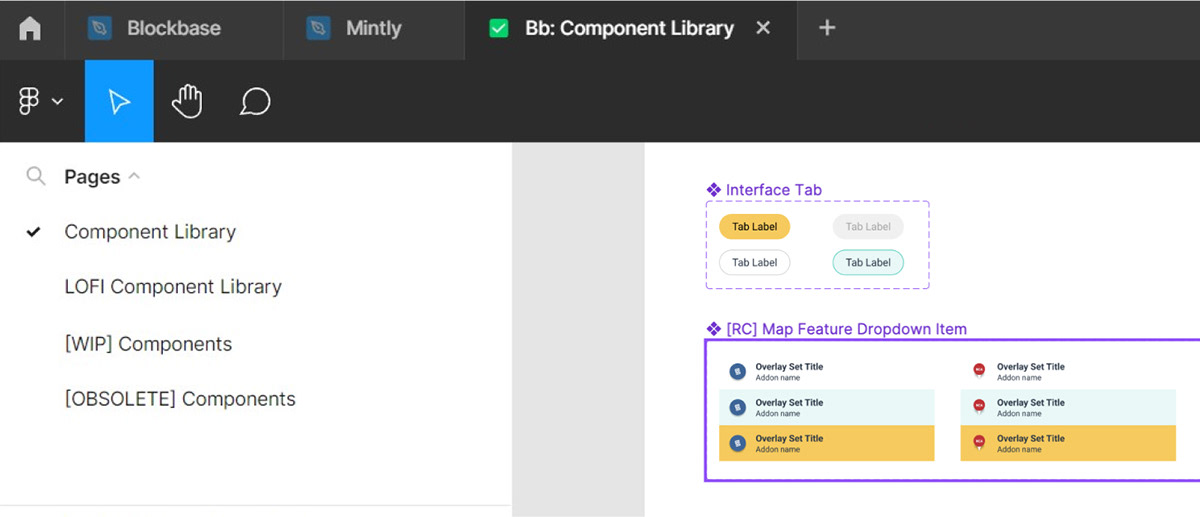
I implement naming conventions in components to deal with this. These prefixes in components indicate to team members what a component is in, so that if they find it while searching the library, they understand if they should use it or not.
No prefix: This is a standard component which a team member can use confidently.
[WIP]: This indicates that the component is currently being created and should not be used by anyone other than the person actively working on it. Even though it is a work in progress, it may still appear in the published component library so that that team member can work with it.
[RC]: This indicates that the component is believed to be complete (Release Candidate) and shouldn’t have any significant changes applied to it. I can be used by others if desired, but isn’t 100% locked off yet.
[OBSOLETE]: This indicates the component has been superseded and should no longer be used.
As well as enabling controlled use of new components, this technique also enables careful updating of previously used components without negatively affecting previous uses of them. Instead of editing previous components significantly, they are copied and and the copy is prefixed with “WIP”, then once complete, it’s prefix is changed to “RC” and the original component is prefixed with “OBSOLETE” and moved to another page.
This ensures that a team member can’t accidentally update a component’s usage in another file, as previous uses of the component will be linked to the obsolete version - requiring a more conscious process of switching to the new component.
These pages and prefixes can be seen in the below screenshot:
Component Documentation
While sub-components are simple enough to not require any written documentation, block and container components receive a documentation page that links to the item in Figma for easy access, and breaks down all the state logic and responsivity details needed to correctly implement or QA the component—Information that is not easily communicated through a Figma design file.
Each component documentation page is constructed with an excerpt showing a quick description of what it is and a screenshot preview of some example use cases. This enables the easy construction of visual index page that readers can browse to find a component.
The below screenshots show how one particular component describes it’s construction and functionality.
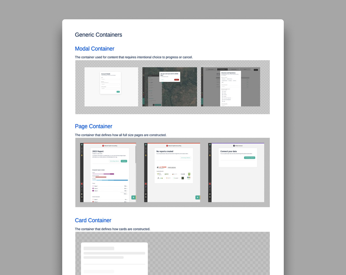
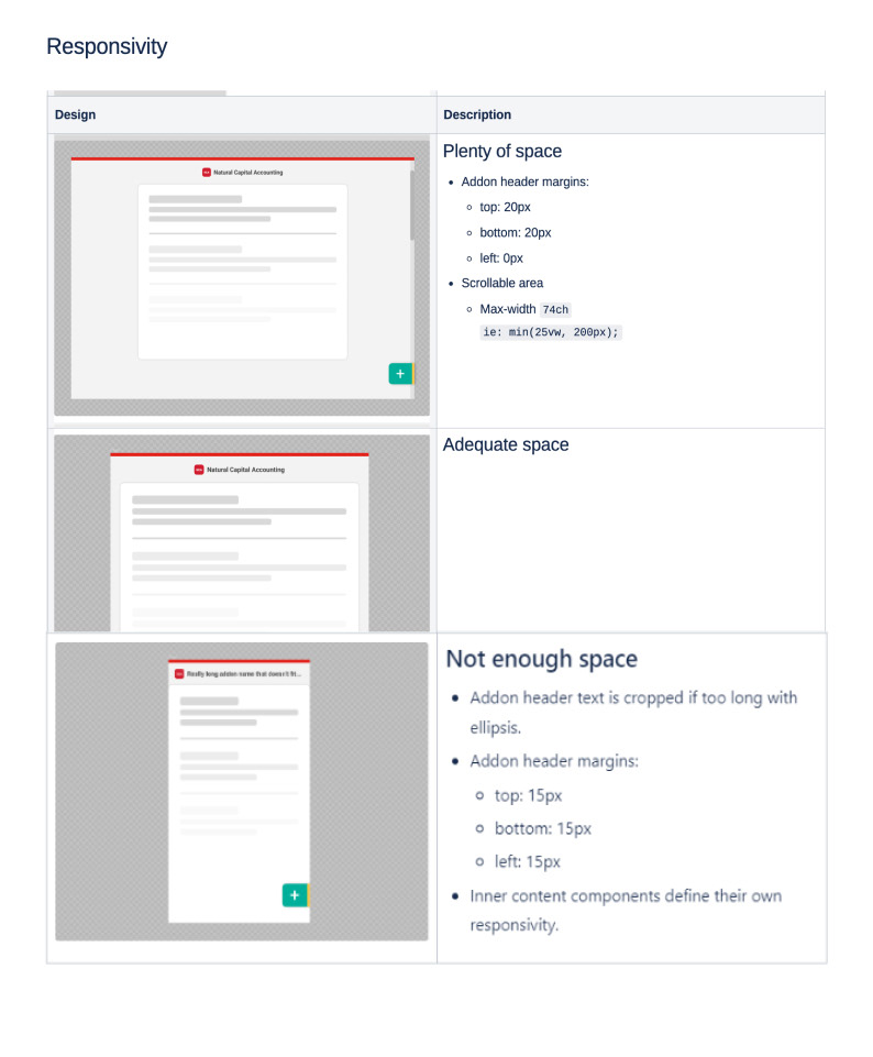
Component pages also describe examples and details regarding how they behave in different screen sizes and any accessibility details or attributes
These are shown below with the Page Container component.
Page Content Definitions
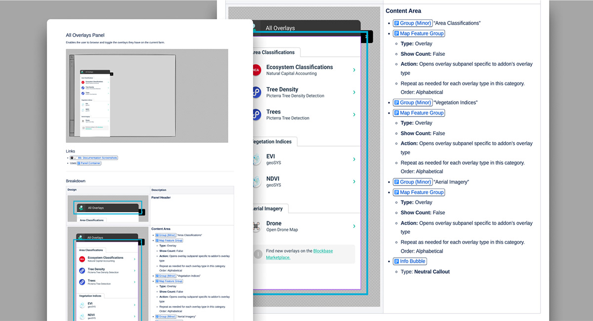
Since each block component has it’s own documentation page, when defining a new content layout, the docs can specify what kind of container, and then simply a list of links to the relevant block components to be used on the page - making page design an extremely quick process.
Below is an example new panel definition, which describes and links to all the block components used.
User Journeys & Flows
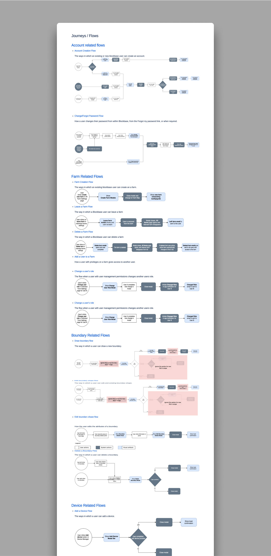
Journeys and flows are treated similarly to component pages by having an excerpt of a flowchart that is previewed on a visual index page for easy browsing.
The flowchart on each page depicts the ways in which a user might experience the journey. This also has some minimal styling to communicate what is a user action, what is a system action, and what is a visual artefact. The page then links to the relevant prototypes as well as any other related documentation pages such as the docs of the visual artefacts themselves—These all have excerpts which include a description and screenshot so that any screenshots and details seen are linked from the page itself as a single source of truth.
The below screenshots show the index page which lists all user journeys and flows, as well as the individual documentation page for an Account Creation flow.
Ancillary Documentation
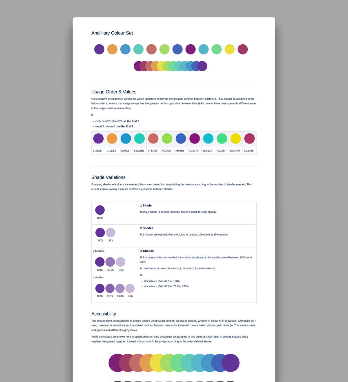
As documentation is created, any smaller aspects like colours and language that should be used consistently across the product get turned into additional documentation pages for easy reference.
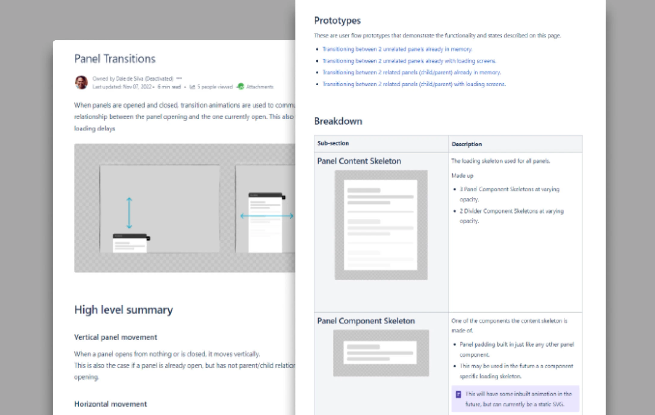
Below shows the colour options defined for GIS map overlays in one product, common validation messages, and loading and transition approaches for panels.
Developer Tickets & Backlog
While general documentation is a useful source of truth for aspects that have settled, as the design team work’s on documentation, they will inevitably be ahead of what the dev team is implementing. In order for team members to know which aspects to implement, the dev and product team can utilise links and link preview excerpts of the documentation in their backlog tickets with any addendums described in the tickets to call out aspects that might not fall in scope for that particular sprint.
This allows the ticketing system (ie. Jira), to be the access point for developers, while the design documentation is the single source of truth.
Release Prototypes
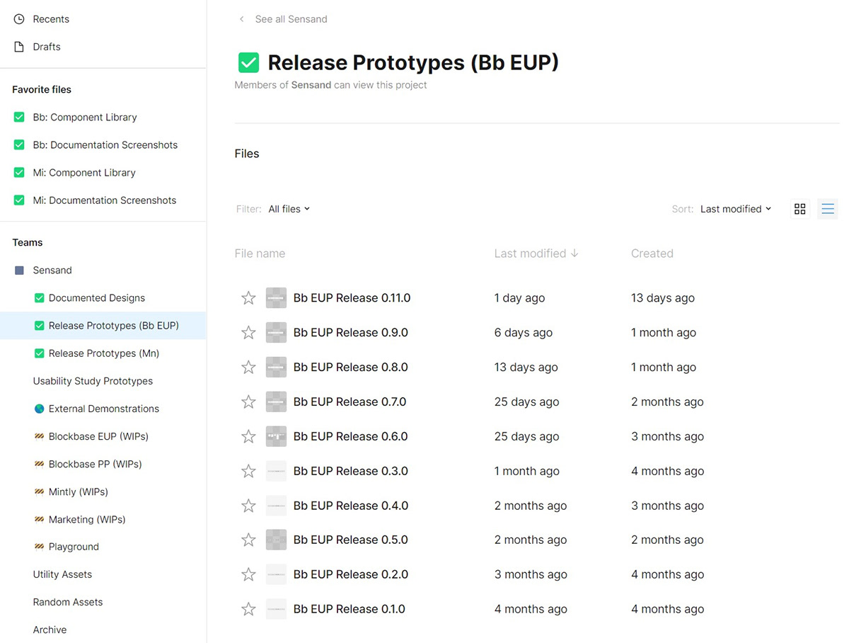
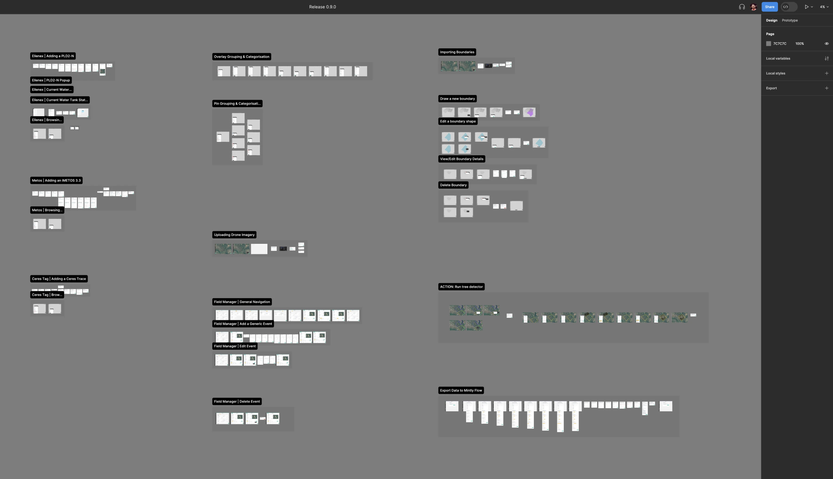
In products that have a specific release cadence, it can also be useful to have a reference of all the features that a particular release of a product should have. While this can be a lot of work if the release cadence is fast, in the past I have used a Figma board specific to each release, into which all flows and necessary artefacts are copied.
As each release board can be a duplicate of the last release board with some additions and changes, maintenance requires less overhead than initial creation.
This resource provides the most value to the leadership team as a one stop overview of everything in a particular release (without the the verbose documentation details), as well as providing substantial value for a QA team to test against in concert with the documentation.
Below is a screenshot of our release boards on a product, as well as a screenshot of two boards themselves (one showing a breakdown of pages for a complicated product).
Maintaining Documentation
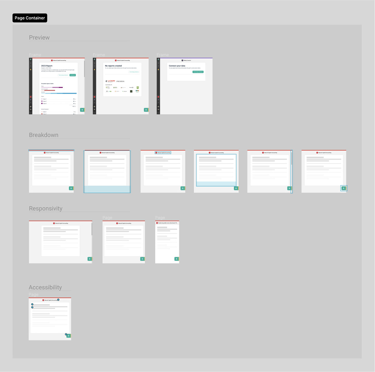
While documentation platforms such as Confluence allow the live embedding of Figma files, in most cases I discourage this as edits to Figma files can quickly cause documentation to become out of sync with the live embeds within them. Instead, screenshots are embedded and a Figma board is created specifically to set up screenshots. This board can then easily be accessed and updated in the future when designs change and screenshots need to be retaken.
Using screenshots in documentation also means that changes to screenshots are version controlled along with the pages themselves - meaning historical versions are always exactly as they were, across text and visuals.
Below are examples of screenshot setups in Figma.
Documentation Rewrites
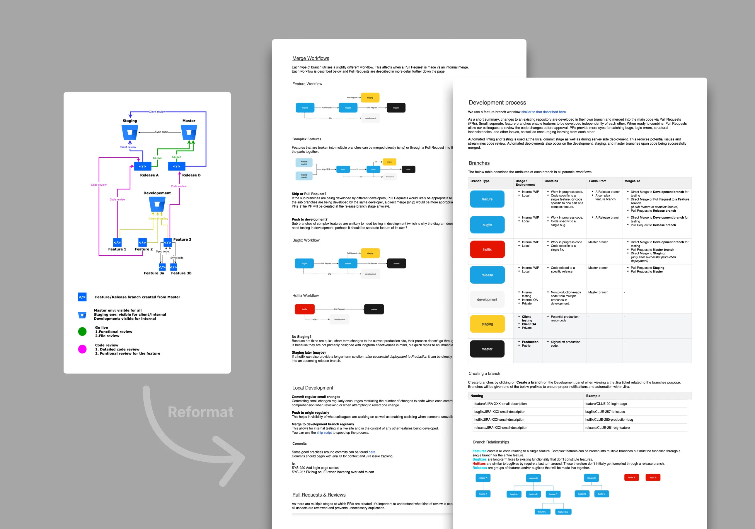
Upon joining various teams, I have also rejuvenated legacy documentation that needed interpretation and re-articulation.
The below is an example of DevOps documentation that was solely encapsulated in a complex and hard to understand diagram. I clarified the diagram with stakeholders and reformatted it into clearer, more modular, documentation.