Blockbase
Blockbase Client Project
Tasks: UI Design, UX, Conceptualisation, Documentation, Art Direction, Team Management
Blockbase is a a GIS product (Geographic Information System), that enables land managers (Often farmers) to access various data ingestion tools for monitoring and tracking their land and land use.
When I joined the team in 2021, there were many developers working on proof of concept elements, but the team was in dire need of a product designer to define how their grand vision would be achieved.
The vision when joining was to build a user friendly GIS platform that 3rd parties could build on top of through an complimentary no-code development platform. This meant carefully planning visual artefacts that we could use to build the foundational interfaces now, that could also be evolved to meet the needs of a developer facing platform later.
As Head of User Experience and Design, I took a front row seat in defining the approach to the product. This meant providing definition and understanding to the whole team across a range of aspects from Information and necessary System Architecture considerations, UI designs, usability testing, and documentation.
The below descriptions step through several of these considerations and artefacts.
Map Layers & Pins
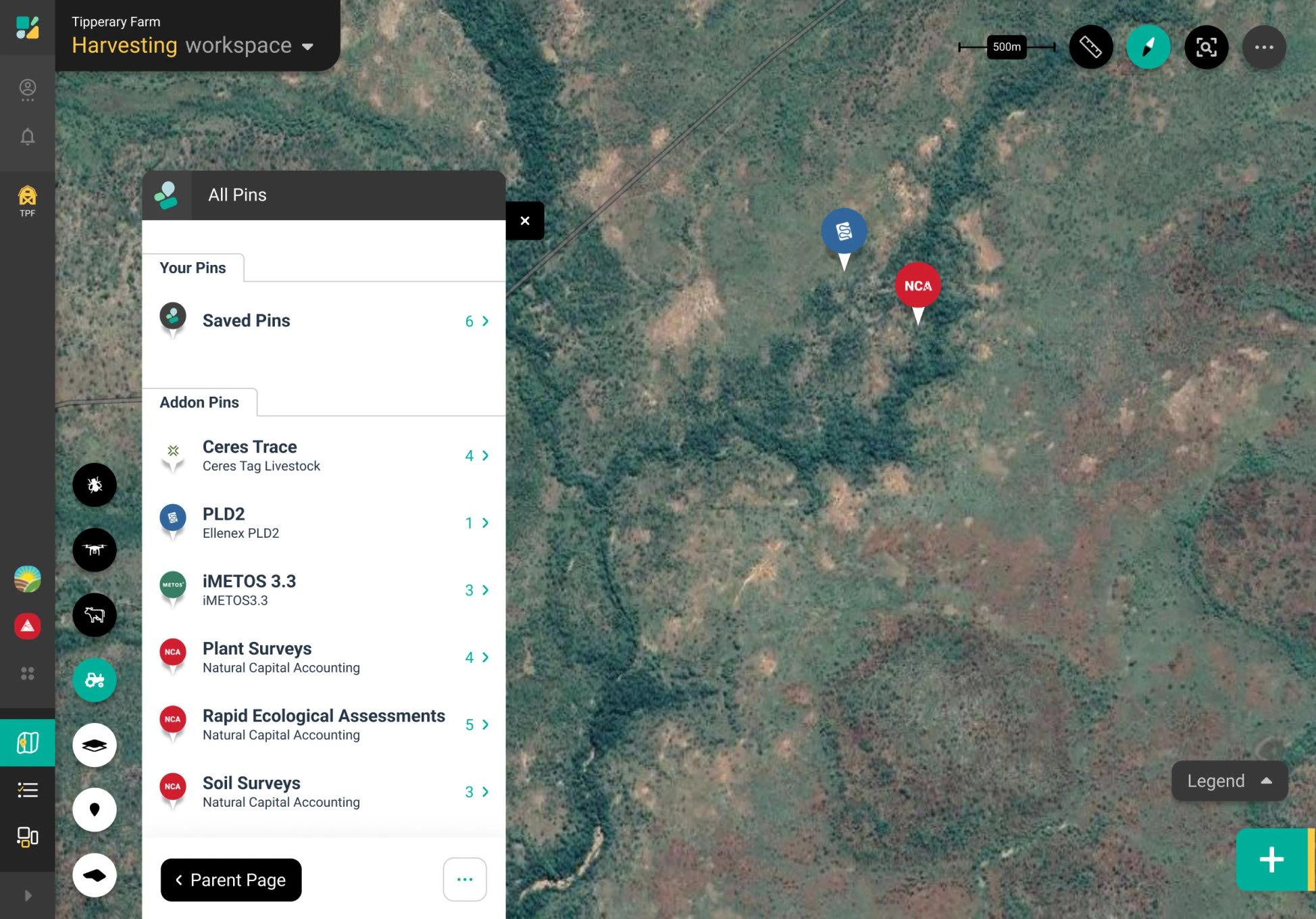
One of the core features of Blockbase was the ability to see all of your devices and geospatial data in one map at the same time, regardless of the 3rd party hardware vendor that provided it. Significant consideration was therefore given to how various data layers, devices, and data pins could be abstracted into reusable components with consistent meanings, while also clearly indicating 3rd party brand connections and allowing for evolution as the platform grew.
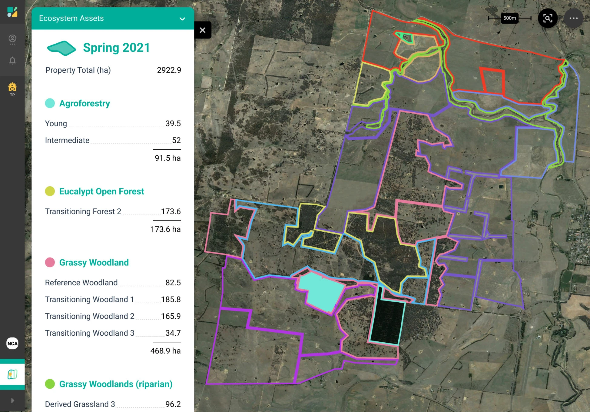
In the images below you can see Area Classification type data visualised as shapes, as well as an initial brainstorming of other future types of overlays that might have needed cursory consideration. You can also see how pins appeared on the map and how they were browsed and toggled.
Popups & Panels
As elements in the map were clicked on, or map related processes started, we need to also define ways that data could be presented or browsed which would both allow for consistency within Blockbase, as well as allowing for brand visibility of 3rd party partners.
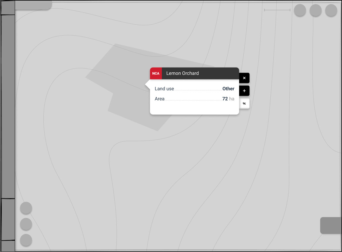
Popups were designed to reveal basic information upon the immediate click of an element, as well as a panels, which allowed for significantly more content while remaining within the map context. Both of these also required significant consideration around loading latency and container sizing—Flexible sizing providing an added complexity due to the loading latency variations.
A guiding principle taken during UI design assumed the need for in-context tablet use by farmers away from their desk. This assumption was followed whenever interfaces could support it without negative affect on desktop use or a significant complexity increase in development. Instances of this include certain high use elements being anchored lower and near screen edges; Allowing use by thumbs on a tablet and enable resulting map that aren’t visually blocked by the hand or arm that initiated them.
Below you can see the popups and panels mentioned above, as well as a glimpse at the overall UI approach.
Pages
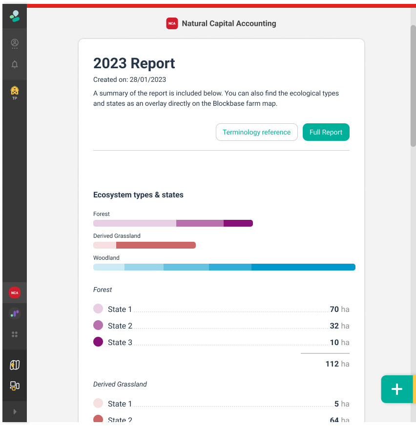
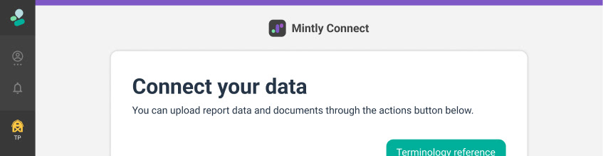
For instances where information outgrew the map screen, or where the information wasn’t geo-spatial data, pages were designed as a fullscreen container that could be used instead.
This continued to require delicate consideration of how to support customisation of 3rd party brands, while also maintaining style and mental model consistency across Blockbase as a whole.
In the images below you can see pages from 3 different apps and how the header styling adapted to the app identities. These apps were all internal and therefore did apply significant customisation.
Dashboards
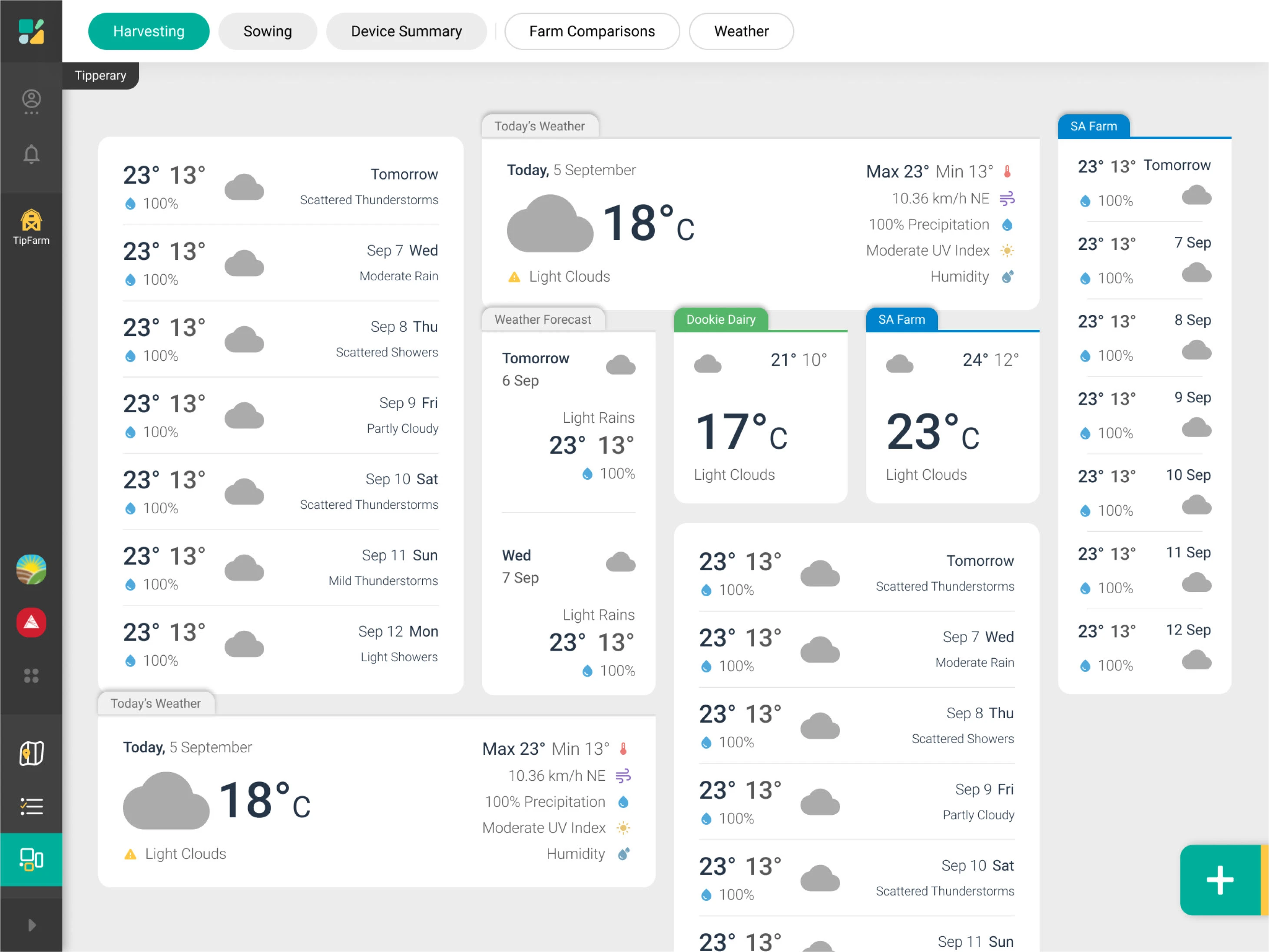
With so much data coming from various devices and services in the one platform, a dashboard to collate snippets into one page was an inevitability. And as such, issue of 3rd party branding fitting into the design system was exacerbated here, as multiple brands and their content would be visible at the same time and right next to each other.
An additional goal was creating in solving complexities around responsiveness. By creating a platform that tied many services together, we would help solve and simplify interoperability for developers and users, and by defining a consistent set of interface artefacts, we had the opportunity to take on the responsibility of ensuring responsiveness for the 3rd party developers.
Below is an early design experiment responding to the idea of the user creating multiple dashboard configurations, and being able to include some widgets from other property accounts (At the point of time this was created, only weather widgets had been designed). Also included is a brainstorm screenshot demonstrating some experimentation around responsiveness ramifications.
Forms
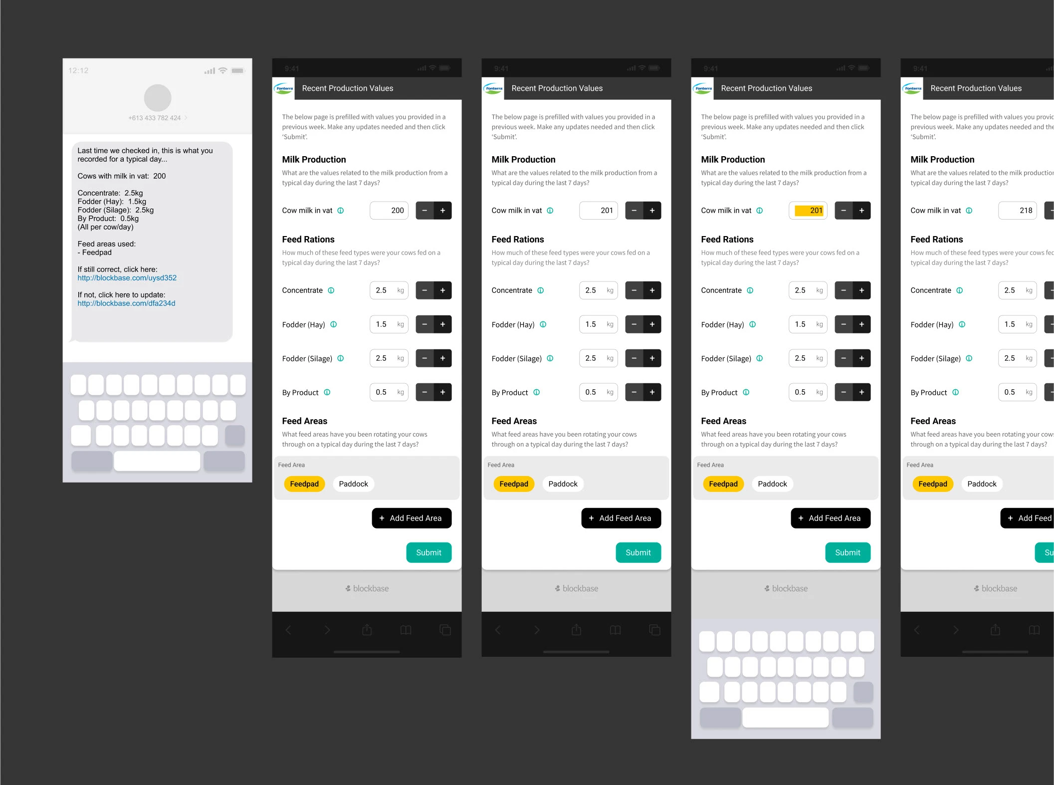
In addition to the UI artefacts above, one of our partner projects also required farmers to be able to ingest data into the platform while in-field. This meant building an interface for user based data ingestion, which we designed as a forms element.
While the main platform wouldn’t be immediately built for mobile, the forms functionality would need to be, but would maintain some of the same design principles as the rest of the product.
Below is a snippet of a user journey prototype that begins from an SMS.
3rd Party Addons
The artefacts described above were designed to support internal use by default Blockbase functionality, but also to be components that 3rd parties could utilise in the developer platform to create their addons.
Addons were conceptualised as containers that could utilise several pages, panels, pins, popups, forms, and map layers that could interact with underlying data, functions, and connections to enable support for certain devices, services or processes. All of which would become available in the platform only when the addon was activated.
Prototypes
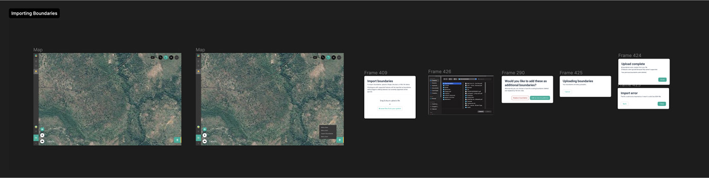
The design team developed countless prototypes to test the functionality and approach of various concepts.
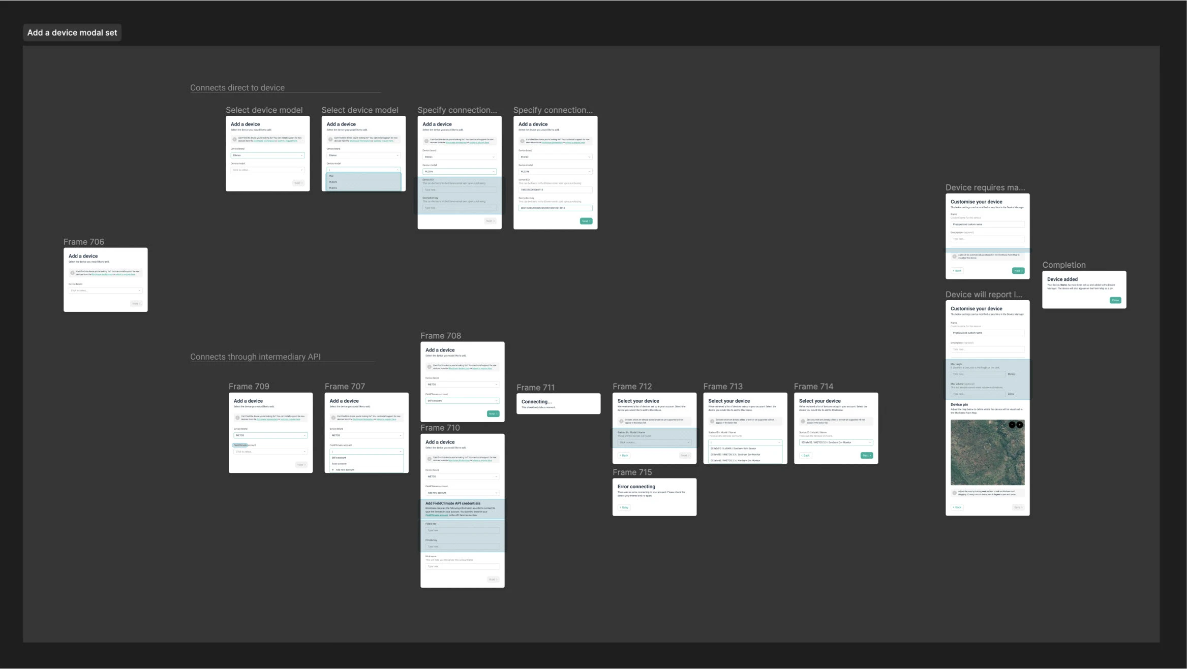
Below are two of the most fundamental ones; One which allowed importing of basic shape files, and another which provided the scaffold for adding new devices that could require different connection methods, and thus had different potential flows that could be utilised by the addon developer.
Branding
In addition to overseeing and being directly involved in the product design, I also art directed and aided design of several branding artefacts.
The Sensand logo was developed externally but in response to one of my sketches. The sketch pursued a modular shape based design so that future logos and icons in the brand could utilise similar assets.
Below you can see the main Sensand logo that was designed as well as the Blockbase and Mintly logos that I later designed directly to fit in with the branding.
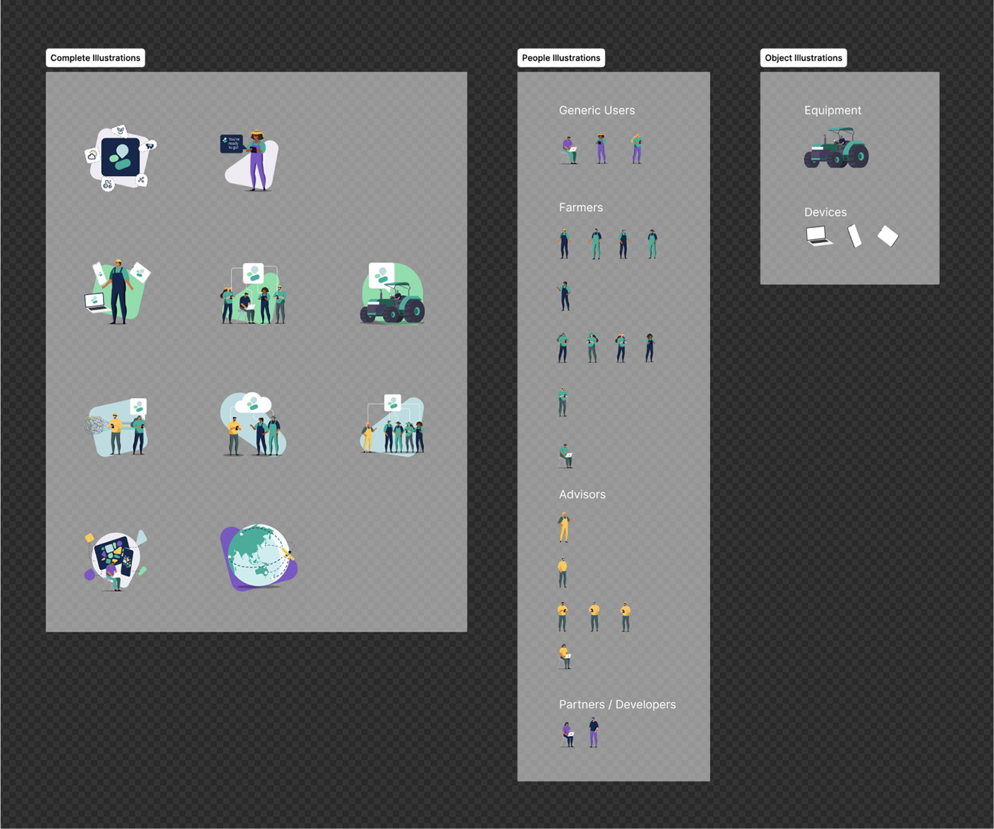
I also worked with a contractor to develop a series of illustrations that could be used on the website and throughout the product.
Below you can see the illustration library as well as one of the assets used in an email design.
No Code Platform
While not part of initial development, the vision for the product to be extendable through a no code developer platform meant there were several assets and and prototypes needed to communicate what this meant and align the teams understanding of how this long-term goal might inform our immediate developments.
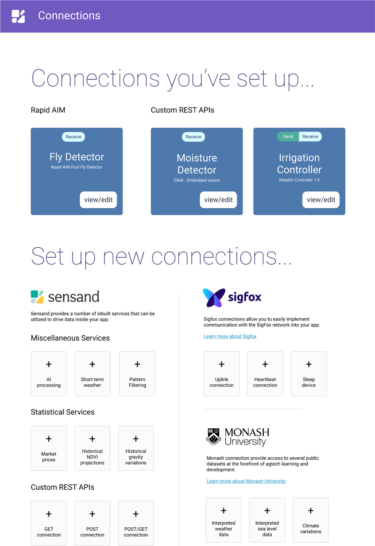
Below you can see several assets developed for pitch decks and internal understanding—Used to communicating how Blockbase addons could be built from a no-code interface and how this process would translate to Blockbase UI artefacts in the end-user platform.
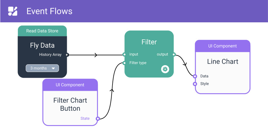
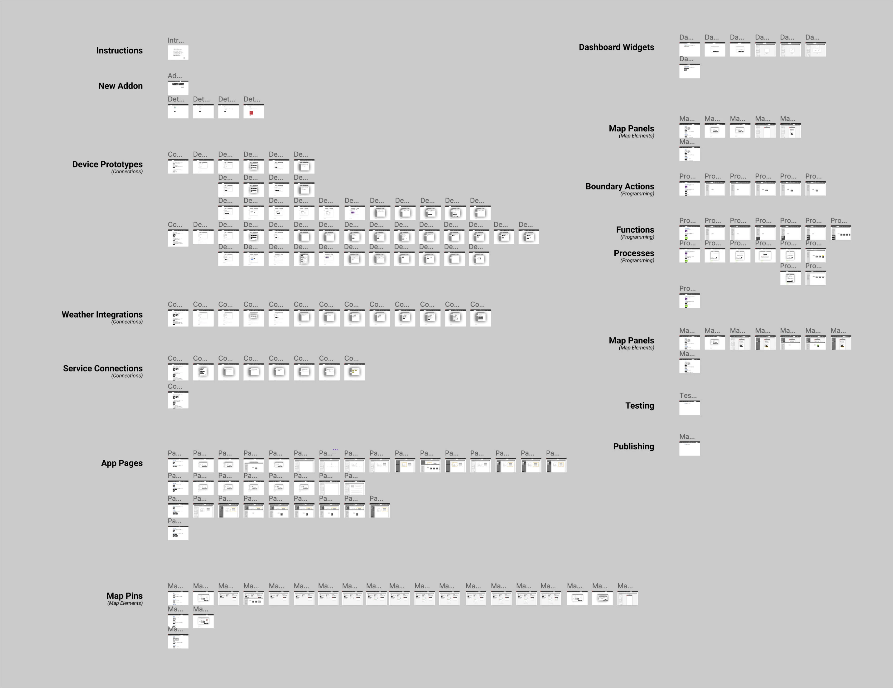
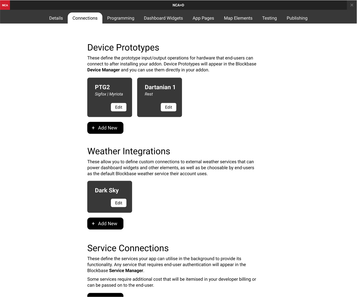
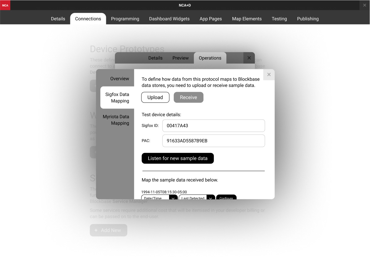
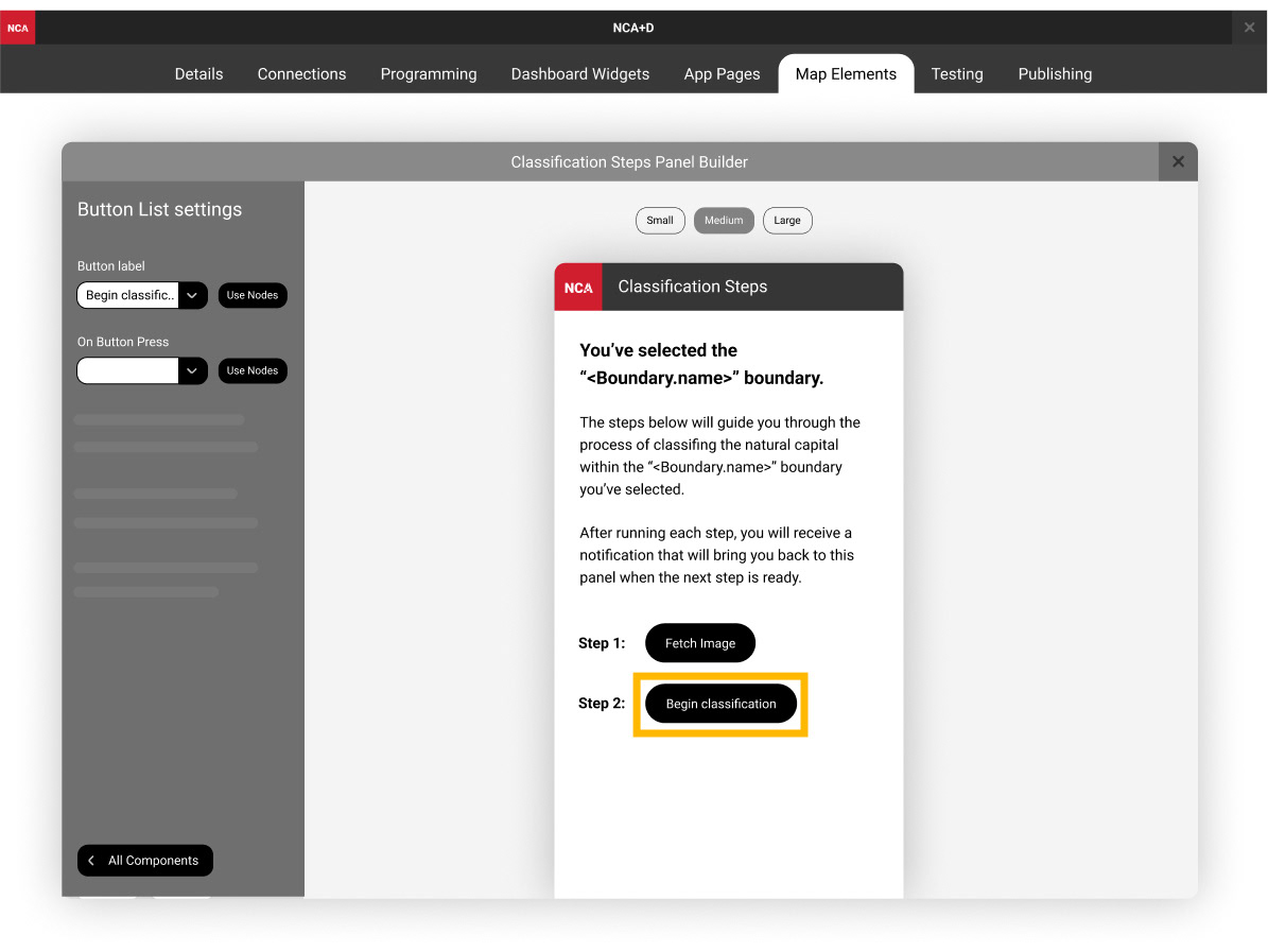
A detailed lo-fi flow was also built to demonstrate how a 3rd party developer might use the developer platform to create many of the connection abilities and UI artefacts that the end user would eventually see in the primary platform. This prototype was designed to be a tool to align the teams understanding of what it meant to have a no-code platform and what considerations needed to be made.
Below you can an overview of the lo-fi prototype, as well as several of it’s screens.
Visit Sensand.com.au to see the product.